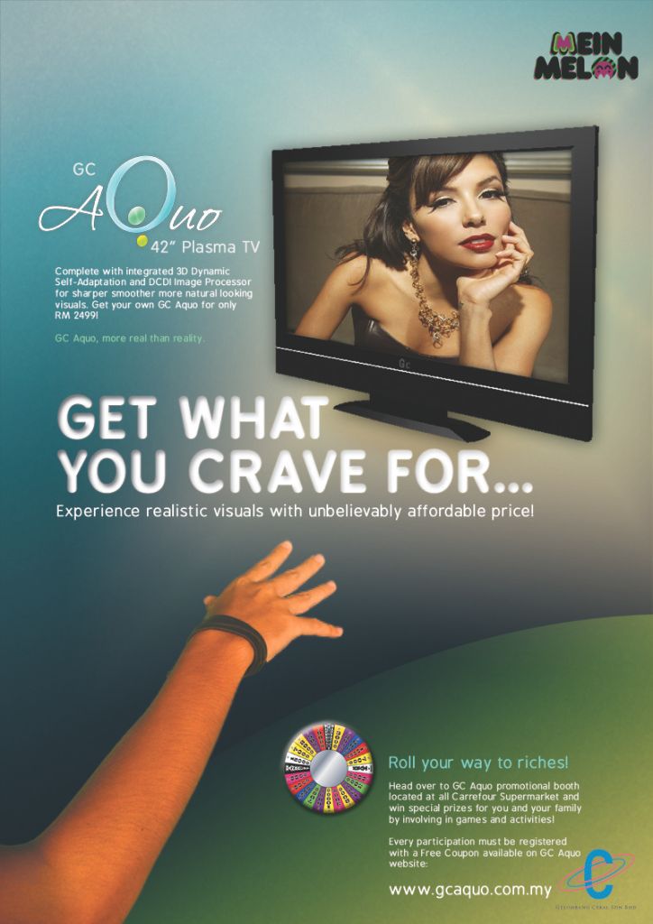
this is my version of the GC Aquo printed ad.. aiyoo lame giler till i had to push my COpywriting revision til now! the exam starts in another 2 hours :) and i don't even have exam slip! apetah Finance MMU ni.. org dh byar awal2 kne bar plak.. dodol..
simply put, Eva Longoria looks soo real that the guy wants to grab her.. i'll explain more later la if you don't understand.. if i don't study Copywriting now, i won't even have any clue what i'm gna write later on..
that GC plasma tv was not originally named 'Aquo'.. we came up with the name.. inspired by Sony Aquos.. hehe..
UPDATE 1 - Print Ad Description
The print ad can be simply summarised as showing how real Eva Longoria, a hot and beautiful celebrity wanted by most men, looked inside the GC Aquo 42" Plasma TV that a guy tries to grab her thinking that she's actually the real thing. That's when the Headline comes in inviting the readers to "Get What You Crave for" by experiencing realistic visuals with unbelievably affordable price as said in the Sub-head by buying GC Aquo Plasma TV. The ad is completed by putting the logo of GC Aquo 42" Plasma TV so that the viewres know what is being advertised in this print ad, accompanied by the body copy that informs more about the features of the Plasma TV.
The GC Aquo promotional booth located in every Carrefour Supermarkets is also being promoted in conjunction of advertising the product. Call to action which is the GC Aquo website url is placed at the bottom of the print ad for the curious and interested viewers to know more about GC Aquo and the promotion.
UPDATE 2 - Critics from Lecturers
- it's too safe. you could've blend the images together so that it gives impact. the hand and body copy should be on top of the tv image without covering it too much.
- good Headline
- you could've done so much more on the image of the promotion part by making it festive to attract people more on the matter
- good try
- you should've used the GC logo for the tv, not the Gelombang Cekal company logo
- the words are clear and readable
- mmm.. okeh!
xde plak deorg cakap pape regarding the pixelated .jpeg image of this print ad that i accidentally printed. i should've given lisa the photoshop copy, but i was so dodol i resized the image smaller with lower resolution and i freaking SAVED it then i straight CLOSED the photoshop.. haa.. pandaaii... so i had to print it with lower resolution, that's why it's pixelated..


2 comments:
comments. jangan marah.
naper ada inner shadow kat typo? aiyo old fashion la. spoil the modern-clean-cut-look.
grid system looks ok, but kureng kemas. and must u have that *...* there? provided ke ayat dia? kalau tak, it shouldn't be there. it should only be one dot.
get what you crave for.
and maybe u should've played with colors on *crave*
just an opinion, tho.
inner shadow - coz sbenanye nk buat dea mcm appear on top of the background texture..
*...* - sebab nk dea ade mood "Craaavveee~~" haha..
btol gak bley maen2 colour kt "Crave" tu. x t'pk.. klam kabut mse ni..
Post a Comment