MI Exercise 1: Post's Honey Bunches of Oats Cereal Packaging Design
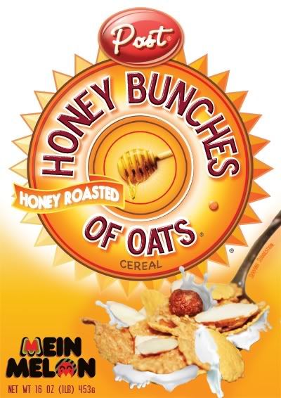
love the name, love the packaging. that's why i chose to design a copy of Post's Honey Bunches of Oats Cereal Packaging. sukela exercise ni! can't wait to do more of it.. yes, bila time susah tu memang perit la kan.. but, the practice and skills that we gained while figuring out how the hell are we gna make that milk splashing like that and those tajam2 round thingy kat blakang tu is much precious than the time we used to gain it.
Click Full Post to see how i did it!

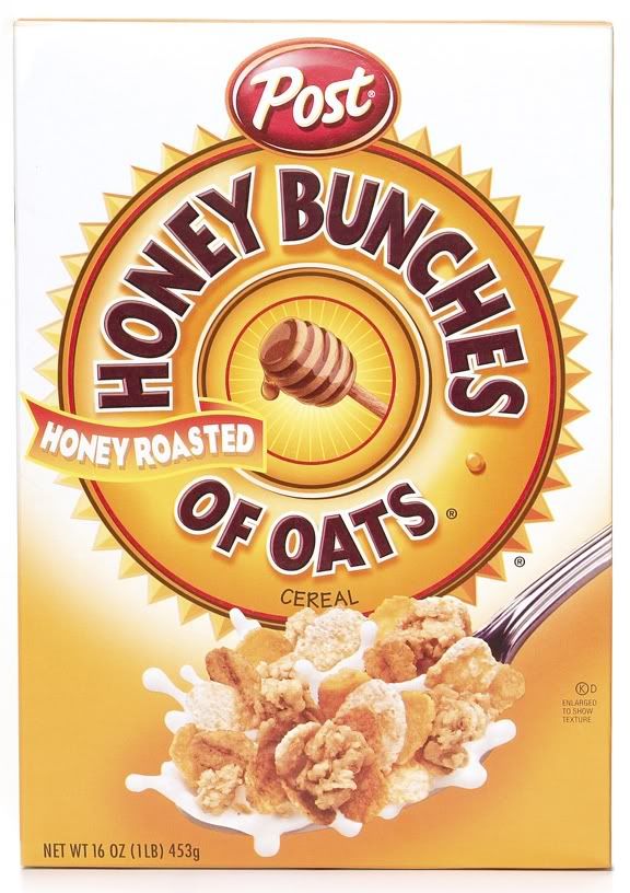
this is the original one. sama tak?? we had to do EXACTLY the same design.
 cereals ni pun kena susun satu2 bagi cantik2.. soo freaking tedious!
buat pengetahuan anda yang tatau menahu, susu2 or any liquid stuff yang ade kat cereal box anda adela fake! sebab, susah tau nk amek pic susu splashing without making the cereal berterabur. so, what i did was, pinjam pictures of milk splashing and honey dripping from Flickr and letak kat cereals tu :D that's not cheating.. if nak ikutkan advertising aspect, that's actually one of the technique nak design food packaging. but, actually i can't really amek pictures orang laen.. but, dah terdesak and ketiadaan susu dalam peti ais, Flickr la jawapannye hehe.. ala. exercise je.. bukan kerja pun.. so thanx to R'eyes', Billy Currie and Kapuxino for the excellent shot of splashing milk and National Honey Month for the honey with the stick thingy! :) oh! not forgetting Abduzeedo's Awesome Milk Typography Tutorial that helped me alot when blending the milk on the cereal.

i used Nestle's Fitnesse Fit and Cornflakes for the cereal photos.. background photoshoot: my wardrobe! :D


3 comments:
wow, nice mein ~ :)
mesti susah. tapi menjadi lah!
thaaanxx!! :D sronok bila orang appreciate our works..
Post a Comment