MI exercise 2: Self Logo Design
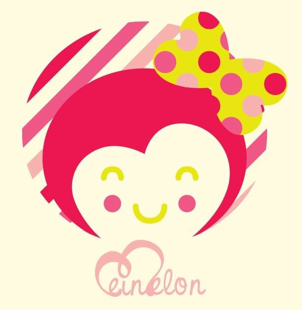
it's sweet, fun-loving and melontastic! what else can i say.. the colours are melon-ish and bright coz i wna show some excitement. the script typography says i'm quirky. i like patterns, that's why you can see lots of patterns on my logo. like how you can change what's inside Coke's silhouette logo. simultaneously, it tells that i can design anything delightfully. if any of my client see this logo, they can expect that i can design something fun and tidy. i used my own cartoon character to create my own logo because i like drawing and designing cartoon characters. we had pretty much 20 minutes to sketch this logo. so, this was what i came up with.

Mein Melon Logo Experimentations
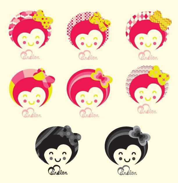
my logo is playful and versatile. it can be designed into as many patterns as appealing to the eyes. it's like how other designers can change and mask tons of graphics inside and MTV silhouette logo. simultaneously, these variation of logos tells that i can delightfully design anything.


what do you think? does it suits me?


3 comments:
nice mein.
kalau u tak letak text mein melon tu pun dah boleh teka logo sapa ni.
hehehe.
it suits u!
mein dah berjanggut dah tunggu ni...
btw, aku dah tukar URL
http://yobsumo.blogspot.com/
replies:
ajwad - heh! bley teka ek.. hehe.. thanx!
syahir - OMG! lupaaa! takpe2.. aku submit assignment bout pullman tu dis wednsday.. so b4 dat i MUST edit the pictures..
Post a Comment