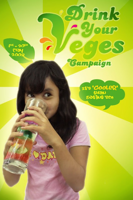
Edited Version of 'Drink Your Veges' Campaign Poster for Creative Communication (edited by Kamil)
huh! i almost forgot Friday's d submission for Creative Communication Campaign Poster. our task was to come out with a campaign and make a poster for it. our marks will be judged by the poster ONLY. nothing more.
sape punye idea buat 'Drink Your Veges' Campaign ni?? haha! at first, Yan came up with the campaign for 'Eat Your Veges'! we were very thrilled to go for that idea coz we figured no one's ever done it before..
den ble dah last2 minit ni.. bru nk edit d photos that Dy dah amek using her sister as a model for the ad. but suddenly after 2 hours of editing d photo, we just realized that the photo Dy had taken was in smaller sizes! can't print it in A3 paper.. mmg pixelated nnt.. so.. ape lg.. Dy amek cam.. shot me with a Blender full of sink water.. haha..

wrong size! Dy's sister was cute though.. :D
den we changed the poster title to 'Drink Your Veges' coz it's Cooler than eating it.. hehe.. plus it's more innovative.. if just eat ur veges, people won't look at it seriously.. it's like forcing someone to do what they don't wna do.. if we put Drink Your Veges, people will say "whoa.. ok.. that's new.. why should i?" so we put the details of the activities fo d campaign at d bottom right fo them to know more about the campaign.. what's left is just d venue.. alamak.. baru t'ingat nk letak!! the word campaign pun lupe letak! haih~ nevermind...
if u noticed, d 'V' at the 'Veges' is shaped like a leaf.. that's our campaign logo..


No comments:
Post a Comment