thanks to everyone who appreciated our designs and also vote for the logos.. i understand that somehow the logo did not meet some of the hi-com's expectations.. so, we need to re-do the logo.. we'll try to show our new logo designs on hi-com meeting tonight.. i hope everyone can be satisfied with our new logo designs.. and, yes, we'll try to incoorperate the theme for RMMU Carnival: "go green!" in our logo design too.. note that we also open for any suggestions, critics and anything that anybody wants to say.. we will accept your vies whole-heartedly
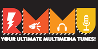
RMMU Typeface
i think some of you can't really understand the word 'RMMU' because the typeface is not vry legible (readable).. we'l try 2 change it to a more legible typeface..
Theme for DJ Club
as we've said before and agreed on, the theme for DJ Club for this whole trimester is electro-pop/funky.. if u want to see some example for the theme, you can go through my inspirations for the electro+pop design..
we've decided to use this theme because we want to attract people who loves music and energetic.. currently, the pop culture in Malaysia is mainly about indie music.. if you see some of MMU students t-shirts nowadays, they use the same type of typeface that i used for 'RMMU'.. well, sort of the same i might add.. so, we're just following the trend.. we don't want to be out-dated.. one of the many qualities that DJ Club want their members to apply is to be up-to-date (you can read the crash course booklet for the reference ) you can browse for some of the t-shirt designs for this theme at my blog too..
in order to get a majority of Malaysians' attention towards RMMU as well as DJ Club, we've decided to use this theme..
The Stripes & Slanted Materials
yess!! the stripes!! some of you might be wondering why did we use alot of stripes for our designs.. let me tell you what i've learnt in my design fundamental class.. in order to get attention, we have to design something that can catch people's eyes.. imagine this.. the whole text in flyers/booklet/banner is just placed in horizontal line.. that's plain boring and cliche'.. what we try to think about and look for is something that can grab people's attention, something that draws people's eyes towards our designs.. slanting stripes is 1 of the way to grab people's atention.. if they see background/text is slanting, they will go "eh...? why is it slanting? what is written here?" and they will read what we've served them.. that was what we've learnt in design fundamental class..
skip to main |
skip to sidebar


![]()


Motiofixo
What's on your mind?
Watchalookinat?
Juicy Award
Clickities
Tumblings
Roll Away
Design Galore
- Abduzeedo
- Ads Of The World
- Aisle One
- Brand Stack
- Branding 10000 Lakes
- But Does It Float?
- Clients From Hell
- Creative Review
- Creattica
- Debut Art
- Design Milk
- Design Work Life
- Design You Trust
- Designspiration
- Dezeen
- Dirty Mouse
- DKNG Studios
- Feature Me
- Ffffound!
- Flowing Data
- FormFiftyFive
- Four Fifths Design
- Fubiz
- Geekiz
- Grain Edit
- Gridness
- Information Is Beautiful
- It's Nice That
- Kitsune Noir
- Line 25
- Minneapolis Egotists
- Motiofixo
- My Modern Metropolis
- Notcot
- Served
- Share Some Candy
- Smashing Magazine
- Surfstation
- Swissmiss
- The Cool Hunter
- The CSS Award
- The Dieline
- Things Organized Neatly
- Thinking For A Living
- Today and Tomorrow
- Typo/Graphic Posters
- Vector Ave
- Vintage Oh Me Oh My
- Visualize
- Web Designer Depot
- White Zine
Copyright
© MelonicManiac 2008-2011.
I don't claim any rights over them. The pictures / videos are solely used for inspiration purposes.

My works are protected under Malaysian Creative Commons License.
My works are protected under Malaysian Creative Commons License.

No comments:
Post a Comment